November 15, 2016
In
featured work, real wedding, tropical, wedding invitations
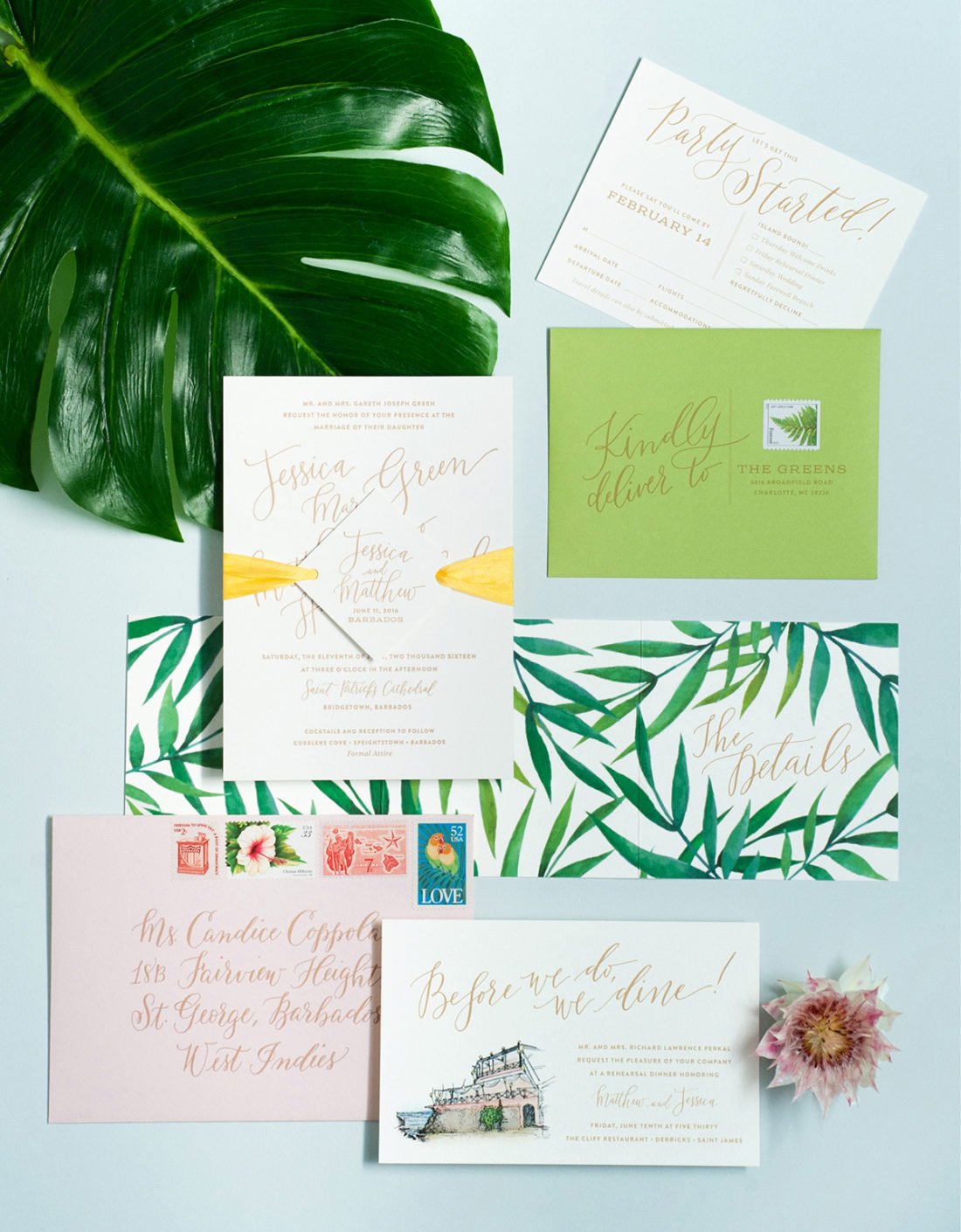
Modern Tropical Destination Wedding Invitations
Jessica and Matt came to me by way of the fabulous Jubilee Events, who created the vision for their destination wedding in Barbados. Out of the gate I knew Jessica was my kind of gal when she expressed that it was important for their invitations