August 4, 2015
In
real wedding, tropical, wedding invitations
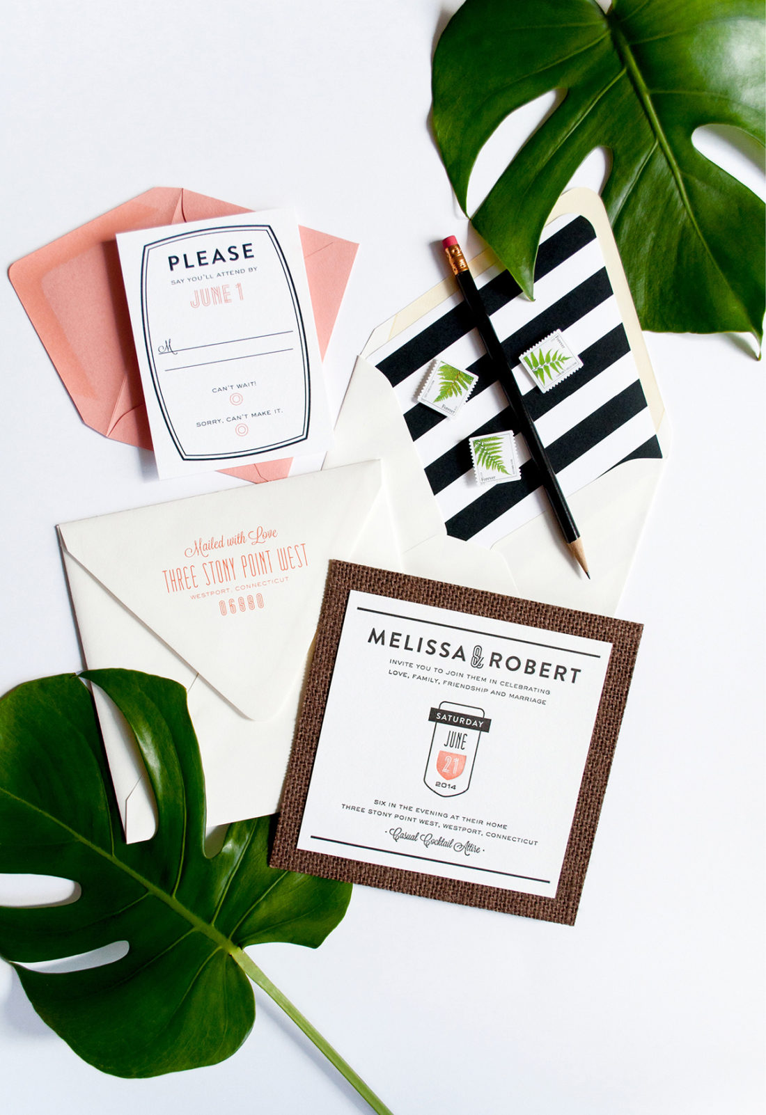
Melissa and Robert’s Graphic South Beach Wedding Invitations
Melissa and Robert went about their wedding celebration a little different than most. They celebrated with a close group of family and friends 18 months after their marriage – and birth of their twin boys! Melissa sought the help of Sarah of A Polished Plan